There are murmurings that the humble safety poster could be having a moment. So what makes for a powerful poster?
Features
Stick ’em up! the art of the safety poster
Posters might seem like vanished art, a quaint relic from an age before smartphones, email, apps and AI.
Yet, this year, new regulations kicked in making it a legal requirement for more signage post Grenfell. From 23 January, all high-rise residential buildings in England had to install wayfinding signage in their buildings.
According to John Davies, managing director at Fastsigns UK, signs (and by extension, posters) are having a moment: “We’ve seen a dramatic shift in attitudes towards health and safety signage, not only since the Grenfell inquiry but since the pandemic where [it] was invaluable.” Digital posters in particular have seen “exponential growth” he stated in Facilities Management Journal’s May issue.
So, it seems that far from heading for the dustbin, workplace safety posters have a future. But what makes for a good poster? What do behavioural specialists think about what styles and communication tactics work best? What posters from the past can we learn from?
 A poster from the British Safety Council's archives
So, what function does the poster fulfil?
The poster or sign’s function is to tell or remind a person what he/she/they must to do to be safe. Posters can compliment formal training, because they are punchy and direct and more importantly, a visible reminder in the workplace. “Implementing workplace health and safety policies often relies on a lot of reading, instruction and learning on the part of workers, with the most dangerous professions requiring complex training programmes before the work can be attempted safely,” says Kevin Rowe in his blog for SafetyBuyer.com. “In this context, the value of safety signs lies in their ability to communicate the most important safety messages in a way that’s visual, immediate and precisely targeted.”
A strong message is key
So where to start? When designing your poster, it’s a good idea to begin with the message. Indeed, Dean Papadopoullos, who has designed posters and magazines for the British Safety Council for over 15 years, says: “A good design brief comes down to the message being strong. I can piece a visual together based on the message having good impact.”
If we look at the British Safety Council’s archives, it’s interesting to see that the posters which work share both a compelling visual and a direct message. “The most important thing with posters is one – the message and two – visually it needs to be clear and compelling and concise,” agrees Dean.
 Produced for our Time to Breathe campaign, this poster imagining exhaust pipes as cigarettes was intended to make people think about air pollution in a different way. Photograph: British Safety Council archives
Use simple language
With word space limited and attention spans short, language used on the poster must be simple. Jonathan Van-Tam, former deputy chief medical officer during the Covid pandemic, spoke of how leaders handled the communications aspect of staying safe in the crisis. “Don’t try to impress with language, use language that’s normal, the kind you would use in the pub – it’s about giving people information for action to get through the crisis,” he said at the Safety & Health Expo in May. When you think of the ‘Hands Face Space’ poster, it was effective and easy to grasp.
Difficult decisions
But what happens when there are many risks involved in a work activity, and therefore many different safety messages? Take work which produces dust like construction or welding – remembering to wear your face mask, or getting it fitted properly, are all equally important directions. Equally, getting people to extract the dust using a machine or to open windows are also all risk mitigating actions.
It’s about deciding on the most important advice that needs communicating at that time. “The difficulty with safety straplines is they over simplify a complex issue,” Van-Tam explained. “‘Catch it bin it kill it’ might be one message [to control a virus], equally, stay home is an alternative one. You have to decide and agree on one version of advice.”
Tactics
Safety is a serious issue. But does this mean we have to be serious with how we communicate important matters? Neuroscience research reveals that we are wired to remember things better if they make us laugh. Experts say that humour activates the brain’s dopamine reward system, and cognitive studies show that dopamine is important for motivation and long-term memory. And our archives show that humour was used a lot in early years of the organisation, yet today humour is not a tactic we see in safety comms generally and not in our more recent poster designs.
Still, quite recent campaigns using humour have been shown to be incredibly effective. ‘Dumb ways to die’ was a 2012 campaign by Metro Trains in Melbourne, Australia. A catchy and strangely emotive song featuring funny lyrics about all the dumb ways you could die was released in parallel with a poster and video campaign. It led to a 21 per cent reduction in train station incidents.
According to Dean, for a poster, or any piece of design, to work, it should make the viewer ‘feel something’: “You’re trying to get a feeling out of the person when they are looking at the visual. That’s really important,” he says. Does he mean dramatic and eye catching? “Attention grabbing is part of it. But it’s more how do you feel after you’ve seen it? I’ve often looked at things, adverts and then as I drive or walk away it can make me reflect – something that makes you think is always more impactful.”
 A strong message and a compelling visual are key to a good poster. Photograph: British Safety Council archives
Feel the fear?
Those wily people, advertisers, often use emotional response to sell their goods. According to a study by the Institute of Practitioners in Advertising, ads using rational content were half as likely to succeed compared with those which used ‘emotional pull’.
In the world of safety, traditionally we have used the emotion of fear to motivate a response. Think of the many speed awareness posters (see Transport for London's ‘watch your speed’ poster series) that dramatically show how dangerous driving kills. The British Safety Council has also used shock tactics to persuade people to be safe. (See above: ‘keep guards on’) Often, illustrations were preferred to soften the impact.
But, in their podcast, ‘Do shock tactics work?’ (from the The Safety of Work podcast series), Dr David Provan and Dr Drew Rae from the Safety Science Innovation Lab at Griffith University, say that it’s not clear they work. Dr Rae said shock tactics are “controversial – the evidence is really mixed”.
The academics consider in the podcast if we can learn from the shock posters that have worked, and if the ones that didn’t work share common themes. The relevance of the poster and message to the viewer is key, says Rae. “If people think they aren’t going to experience the consequences [of the risk shown] then they won’t be activated to [respond].” Likewise: “If it’s too graphic or too extreme, people won’t believe it’s a credible story that will happen to them.” An example they gave was a poster showing a severed hand and asking the viewer to remember to wear gloves. Not likely to protect against the threat!
Shock style posters can also backfire. People can get angry, go into counter-attack mode or into denial. Or they can laugh. In January 2021, the government ran a Covid safety poster with the caption: ‘Don’t let a coffee cost lives’. Featuring some friends on a bench outside having a chat, few took this seriously. As one Facebook user commented: “When out for my daily walk today I saw two couples having a chat – appropriately socially distanced in the fresh air. And they had coffees in hand. Thank goodness the police weren’t around! Ffs – what has this country come to!”
 Often, our posters have used illustrations to soften the impact of shock tactics. Photograph: British Safety Council archives
Fear tactics have their place, but need to be used judiciously, and perhaps best in the form of personal testimonies, says Dr Provan: “I still feel like shock tactics have a big place in safety management strategies in organisations, [but that might be] via speakers who lost limbs or got burnt because they didn’t follow safety behaviours.”
Today, shock posters might be misinterpreted as insensitive says Dr Rae: “If we are going to do something that could cause harm [to the viewer] we must be very sure that it’s worthwhile. We need the consent of the person that they also think it’s worthwhile. But in the case of shock ads there’s no consent. I think we’re in ethically very dodgy territory.”
So, have fun when designing your posters, make them targeted, clear and relevant. Beyond their role in shaping health and safety behaviours, they can also help create and reinforce a workplace culture. For example, putting a poster up in the office to communicate that bullying isn’t tolerated at work and who you can speak to about it if you’re suffering can be a really powerful and gentle way of reaching people who might be afraid to speak out. There are many reasons and uses for a poster. So stick `em up!
Visit British Safety Council archives here


FEATURES
Why changes to recycling legislation in England are an opportunity, not a burden
By on 12 November 2024

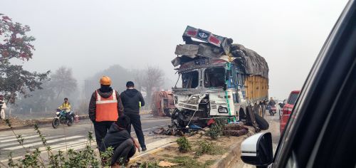
Road safety in India: could better road safety, vehicle technology and enforcement make driving for work safer?
By Orchie Bandyopadhyay on 10 November 2024
India has a poor road safety record, and research shows that commercial vehicles are a major contributor to the problem, with trucks estimated to be the single largest vehicle type involved in impacts leading to fatalities. We look at solutions that could make driving for work and the roads in general safer – from in-vehicle technology that warns truck drivers about unsafe behaviour to improving the design features of major highways.

